WEBSITE DESIGN SERVICES IN GREEN BAY
At Fire Pixel, web design in Green Bay begins with a detailed information-gathering process, where our expert design team collaborates with yours to define the visual goals and objectives of the project. This involves creating a user-friendly design that focuses on functionality, features, and an intuitive user experience. Once these design elements are clearly established, we move to the planning phase, where the website’s architecture, layout, and visual identity are carefully structured.
Our web design service in Green Bay starts by utilizing graphic design tools like Photoshop or Illustrator to craft a visual mock-up of your website. After you approve the design, the project moves into development, where we turn the approved mock-up into a fully functional website at a staging location. You’ll be able to access this throughout the process to ensure it aligns with your vision. Once the design and development are finalized, we’ll take the website live. This process typically takes 30-45 days for an average-sized project, and we pride ourselves on delivering top-tier web design and development services in Green Bay to enhance your online presence.

WEBSITE DESIGN IN GREEN BAY
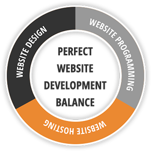
Fire Pixel offers expert website design services, creating websites that are user-friendly, fast, and easily navigable, while also ensuring they are optimized for search engines. We emphasize both the aesthetic and functional aspects of web design, ensuring that the site not only looks great but also performs well in search rankings. We prioritize key aspects of excellent website design and development for SEO:
User-friendly Design
Responsive Design
Optimized Site Structure
By incorporating these aspects of excellent website design for SEO, we will create a website that is both user-friendly and optimized for search engines, which can lead to higher search engine rankings, more traffic, and more engagement with your audience.
Ready to start brain storming? We recommend GlooMaps

WEBSITE DESIGN AND DEVELOPMENT PROCESS – STEP BY STEP
Define the Purpose and Goals of the Website
The first step is to define the purpose and goals of the website. Determine what the website will be used for, who the target audience is, and what actions you want users to take on the site.
Conduct Research and Analysis
Once you have a clear understanding of the website’s purpose and goals, it’s time to conduct research and analysis. This includes researching the industry, competition, and target audience. The research will help you determine the site’s design, features, and functionality.
Create a Site Map and Wireframes
Using the research data, create a site map and wireframes. Site maps show the site’s structure and the relationship between pages, while wireframes are a visual representation of the website’s layout and content.
Design the Website
Once the site map and wireframes are completed, it’s time to design the website. Create a visual design that aligns with the website’s purpose, goals, and target audience.
Develop the Website
After the design is complete, it’s time to develop the website. This includes creating the HTML, CSS, and JavaScript code for the website’s front-end and back-end. You may also need to create a content management system (CMS) to allow users to update the website’s content.
Test the Website
Once the website is developed, it’s time to test it thoroughly. Test the site’s functionality, performance, and compatibility with different devices and browsers. Fix any bugs or issues that arise during testing.
Launch the Website
After testing is complete and any issues have been addressed, it’s time to launch the website. This includes uploading the website’s files to a server and making the site live.
Monitor and Maintain the Website
Finally, once the website is live, it’s important to keep monitoring and don't forget the website maintenance.
WEBSITE DESIGN INSIGHTS

Boost Your Brand with Green Bay Web Design Services
In today’s digital-first world, your website often serves as the face of your business. Whether you’re a small local shop in Green Bay or a growing enterprise, an engaging and functional website can set you apart from competitors and build lasting relationships with customers. There are 1.1 billion websites in the world, according to ExplodingTopics.com. … Boost Your Brand with Green Bay Web Design Services

Maximize Website Speed: Essential Tips for Fast Loading
Website speed is a critical factor for both user experience and business success. Slow-loading pages frustrate visitors, reduce engagement, and can negatively affect search engine rankings. In fact, 53% of visits are abandoned if a mobile site takes longer than 3 seconds to load. Improving website speed is essential for keeping visitors on your site, … Maximize Website Speed: Essential Tips for Fast Loading

8 Key Elements of Green Bay Small Business Website Design Packages
The Small Business Administration highlights that nearly three-quarters (73%) of small businesses across the U.S. have a website. If your business doesn’t have one, you’re likely not reaching as many customers as you should. Quality small business website design packages provide the foundation you need to establish a strong online presence. These packages bundle everything … 8 Key Elements of Green Bay Small Business Website Design Packages
START YOUR WEB DESIGN JOURNEY